
R/ggplot: Controlling X axis order
As part of a talk I gave at the Neo4j London meetup earlier this week I wanted to show how you could build a simple chart showing the number of friends that different actors had using the ggplot library.
I started out with the following code:
df = read.csv("/tmp/friends.csv")
top = df %>% head(20)

ggplot(aes(x = p.name, y = colleagues), data = top) +
  geom_bar(fill = "dark blue", stat = "identity")
The friends CSV file is available as a gist if you want to reproduce the chart. This is how the chart renders:
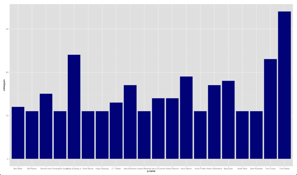
It’s in a fairly arbitrary order when it would be quite cool if we could get the most popular people to show from left to right.
I had the people’s names in the correct order in the data frame but annoyingly it was then sorting them into alphabetical order. Luckily I came across the by using the scale_x_discrete function which does exactly what I needed.
If we pass in the list of names to that function we get the chart we desire:
ggplot(aes(x = p.name, y = colleagues), data = top) +
  geom_bar(fill = "dark blue", stat = "identity") +
  scale_x_discrete(limits= top$p.name)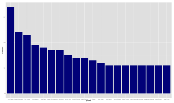
About the author
I'm currently working on short form content at ClickHouse. I publish short 5 minute videos showing how to solve data problems on YouTube @LearnDataWithMark. I previously worked on graph analytics at Neo4j, where I also co-authored the O'Reilly Graph Algorithms Book with Amy Hodler.