
R: ggplot2 - Each group consist of only one observation. Do you need to adjust the group aesthetic?
I’ve been playing around with some weather data over the last couple of days which I aggregated down to the average temperature per month over the last 4 years and stored in a CSV file.
This is what the file looks like:
$ cat /tmp/averageTemperatureByMonth.csv
"month","aveTemperature"
"January",6.02684563758389
"February",5.89380530973451
"March",7.54838709677419
"April",10.875
"May",13.3064516129032
"June",15.9666666666667
"July",18.8387096774194
"August",18.3709677419355
"September",16.2583333333333
"October",13.4596774193548
"November",9.19166666666667
"December",7.01612903225806
I wanted to create a simple line chart which would show the months of the year in ascending order with the appropriate temperature.
My first attempt was the following:
df = read.csv("/tmp/averageTemperatureByMonth.csv")
df$month = factor(df$month, month.name)

ggplot(aes(x = month, y = aveTemperature), data = df) +
  geom_line( ) +
  ggtitle("Temperature by month")
which resulted in the following error:
geom_path: Each group consist of only one observation. Do you need to adjust the group aesthetic?My understanding is that the points don’t get joined up by default because the variable on the x axis is not a continuous one but rather a factor variable.
One way to work around this problem is to make it numeric, like so:
ggplot(aes(x = as.numeric(month), y = aveTemperature), data = df) +
  geom_line( ) +
  ggtitle("Temperature by month")
which results in the following chart:
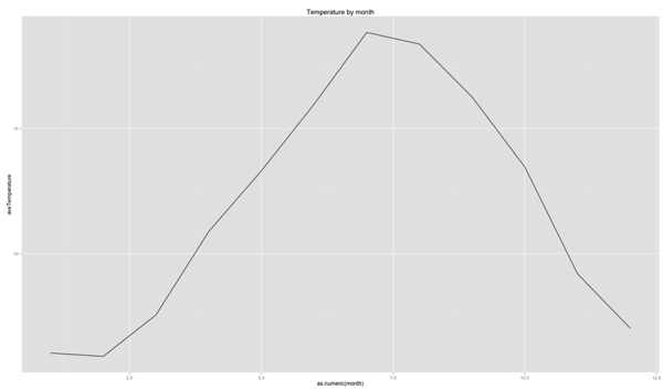
This isn’t bad but it’d be much nicer if we could have the month names along the bottom instead.
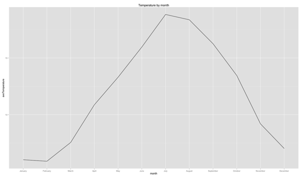
It turns out we can but we need to specify a group that each point belongs to. ggplot will then connects points which belong to the same group.
In this case we don’t really have one so we’ll define a dummy one instead:
ggplot(aes(x = month, y = aveTemperature, group=1), data = df) +
  geom_line( ) +
  ggtitle("Temperature by month")
And now we get the visualisation we want:
About the author
I'm currently working on short form content at ClickHouse. I publish short 5 minute videos showing how to solve data problems on YouTube @LearnDataWithMark. I previously worked on graph analytics at Neo4j, where I also co-authored the O'Reilly Graph Algorithms Book with Amy Hodler.