R: Featuring engineering for a linear model
I previously wrote about a linear model I created to predict how many people would RSVP 'yes' to a meetup event and having not found much correlation between any of my independent variables and RSVPs was a bit stuck.
As luck would have it I bumped into Antonios at a meetup a month ago and he offered to take a look at what I’d tried so far and give me some tips on how to progress.
The first thing he pointed out is that that all my features were related to date/time and that I should try and generate some other features. He suggested I start with the following:
-
info about organisers (quantify popularity of organisers, how many people work for them)
-
info about the venue (how many people fit there, how far it is from the centre of the city)
-
number of tweets for the event, during X days before the event
I’d read a lot on Kaggle forums about how feature engineering was the most important part of building statistical models but it didn’t click what that meant until Antonios pointed it out.
The first thing I decided to do was bring in the data for all London’s NoSQL meetups rather than just the Neo4j one to give myself a bit more data to work with.
Group Membership
Having done that, it seemed from visual inspection that the meetup groups with the most members (i.e. Data Science London, Big Data London) seemed to get the biggest turnouts.
I thought it’d be interesting to see what the correlation was between group membership and RSVPs so this was the first new feature I added.
I generated this feature by a combination of a Neo4j query and R code which resulted in this data frame as CSV file.
We can quickly preview it to see some of the events and the group membership at that time:
> df = read.csv("/tmp/membersWithGroupCounts.csv")
> df$eventTime = as.POSIXct(df$eventTime)
> df %>% sample_n(10) %>% select(event.name, g.name, eventTime, groupMembers, rsvps)

                                                                  event.name                                   g.name           eventTime groupMembers rsvps
23  Scoring Models, Apache Drill for querying structured & unstructured data                      Data Science London 2014-09-18 18:30:00         3466   159
421                                                      London Office Hours                London MongoDB User Group 2012-08-22 17:00:00          468     6
304                            MongoDB University Study Group London Meet up                London MongoDB User Group 2014-07-16 17:00:00         1256    23
43                                                           December Meetup          London ElasticSearch User Group 2014-12-10 18:30:00          721   126
222                                                          Intro to Graphs                Neo4j - London User Group 2014-09-03 18:30:00         1453    39
207                              Intro to Machine Learning with Scikit-Learn                            Women in Data 2014-11-11 18:15:00          574    41
168                                        NoSQL panel and LevelDB + Node.js                             London NoSQL 2014-04-15 18:30:00          183    51
443                                                      London Office Hours                London MongoDB User Group 2012-11-29 17:00:00          590     3
79                                  Apache Cassandra 1.2 with Jonathan Ellis                         Cassandra London 2013-03-06 19:00:00          399    95
362                                                          Span conference Span: scalable and distributed computing 2014-10-28 09:00:00           67    13
One thing I found difficult was finding features specific to an event - I’m not sure how much that matters. I generated features for the venue or group much more easily.
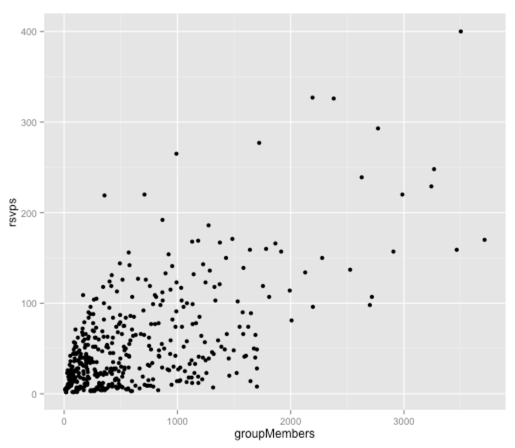
First let’s see if there’s actually any correlation between these two variables by plotting them:
ggplot(aes(x = groupMembers, y = rsvps), data = df) +
  geom_point()
It looks like there’s a positive correlation between these two variables but let’s create a single variable linear model to see how much of the variation is explained:
> fit = lm(rsvps ~ groupMembers, data = df)
> fit$coef
 (Intercept) groupMembers
 20.03579637   0.05382738
Our linear model equation is therefore:
rsvps = 20.03579637 + 0.05382738(groupMembers)
Let’s see how well correlated our predicted RSVPs and actual RSVPs are:
> df$predictedRSVPs = predict(fit, df)
> with(df, cor(rsvps, predictedRSVPs))
[1] 0.6263096
Not too bad! There is quite a strong correlation between these variables although it’s not perfect.
Hours into the day
In my first model I’d treated time as a categorical variable but Antonios pointed out that it’s often easier to understand the relationship between variables if they’re both continuos so I transformed the event time like so:
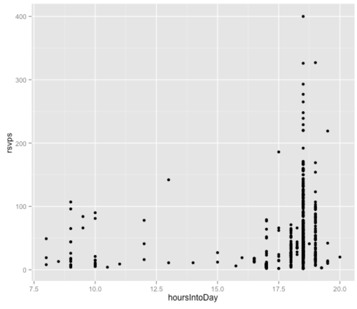
df$hoursIntoDay = as.numeric(df$eventTime - trunc(df$eventTime, "day"), units="hours")Let’s see how that plots against the RSVP count:
ggplot(aes(x = hoursIntoDay, y = rsvps), data = df) +
  geom_point()
It’s a bit more difficult to see a trend here as there are quite discrete times at which events happen and the majority start at 6.30 or 7.00. Nevertheless let’s build a linear model with just this variable:
> fit = lm(rsvps ~ hoursIntoDay, data = df)
> fit$coef
 (Intercept) hoursIntoDay
   -18.79895      4.12984
>
> df$predictedRSVPs = predict(fit, df)
> with(df, cor(rsvps, predictedRSVPs))
[1] 0.181472
Distance from the centre of London
Next up I tried a feature based on the location of the venue that the events were held at. The hypothesis was that if a venue was closer to the centre of London then people would be more likely to attend.
To calculate this distance I used the distHaversine function from the geosphere package as shown in a previous blog post.
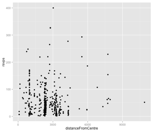
Let’s have a look at the graph for that variable:
ggplot(aes(x = distanceFromCentre, y = rsvps), data = df) +
  geom_point()
It’s hard to tell much from this plot, mainly because a majority of the points are clustered around the 2,500 metre mark which represents Shoreditch venues. Let’s plug it into a linear model and see what we come up with:
> fit = lm(rsvps ~ distanceFromCentre, data = df)
> fit$coef
       (Intercept) distanceFromCentre
      57.243646619       -0.001310492
>
> df$predictedRSVPs = predict(fit, df)
> with(df, cor(rsvps, predictedRSVPs))
[1] 0.02999708
Interestingly there’s barely any correlation here which was surprising to me. I tried combining this variable in a multiple variable model with the others but it still didn’t have much impact so I think we’ll park this one for now.
This is as much as I’ve done at the moment and despite spending quite a bit of time on it I still haven’t really explained very much of the variation in RSVP rates!
I have managed to identify some ways that I was able to come up with new features to try out though:
-
Read what other people are doing e.g. I have some ideas for lag variables (e.g. how many people went to your previous meetup) having read about this baseball linear model
-
Talk to other people about your model - they often have ideas you wouldn’t think of being too deep into the problem.
-
Look at what data you already have and try and incorporate that and see where it leads
</ul>
The next avenue I started exploring is topic modelling as I have a hypothesis that people RSVP for events based on the content of talks but I’m not sure of the best way to go about that.
My current thinking is to pull out some topics/terms by following the example from Chapter 6 of Machine Learning for Hackers.
About the author
I'm currently working on short form content at ClickHouse. I publish short 5 minute videos showing how to solve data problems on YouTube @LearnDataWithMark. I previously worked on graph analytics at Neo4j, where I also co-authored the O'Reilly Graph Algorithms Book with Amy Hodler.
