R: ggmap - Overlay shapefile with filled polygon of regions
I’ve been playing around with plotting maps in R over the last week and got to the point where I wanted to have a google map in the background with a filled polygon on a shapefile in the foreground.
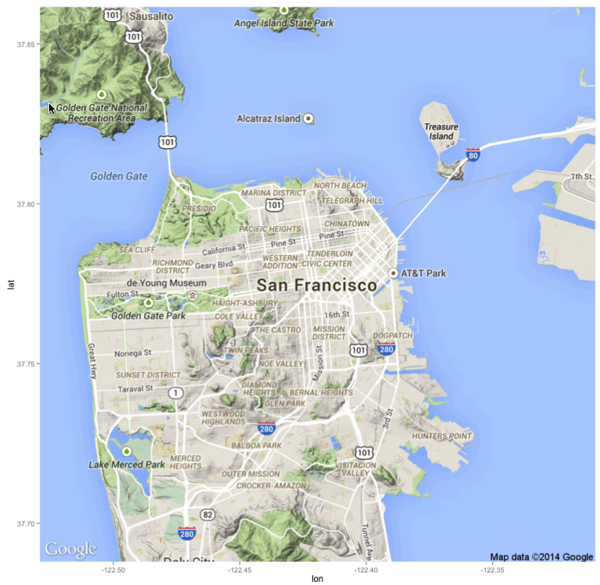
The first bit is reasonably simple - we can just import the ggmap library and make a call to get_map:
> library(ggmap)
> sfMap = map = get_map(location = 'San Francisco', zoom = 12)
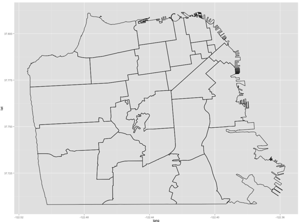
Next I wanted to show the outlines of the different San Francisco zip codes and came across a blog post by Paul Bidanset on Baltimore neighbourhoods which I was able to adapt.
I downloaded a shapefile of San Francisco’s zip codes from the DataSF website and then loaded it into R using the readOGR and spTransform functions from the rgdal package:
> library(rgdal)
> library(ggplot2)
> sfn = readOGR(".","sfzipcodes") %>% spTransform(CRS("+proj=longlat +datum=WGS84"))
> ggplot(data = sfn, aes(x = long, y = lat, group = group)) + geom_path()
sfn is a spatial type of data frame...
> class(sfn)
[1] "SpatialPolygonsDataFrame"
attr(,"package")
[1] "sp"...but we need a normal data frame to be able to easily merge other data onto the map and then plot it. We can use ggplot2’s https://groups.google.com/forum/#!topic/ggplot2/PHaeJNq8eNs command to do this:
> names(sfn)
[1] "OBJECTID" "ZIP_CODE" "ID"
> sfn.f = sfn %>% fortify(region = 'ZIP_CODE')
SFNeighbourhoods = merge(sfn.f, sfn@data, by.x = 'id', by.y = 'ZIP_CODE')I then made up some fake values for each zip code so that we could have different colour shadings for each zip code on the visualisation:
> library(dplyr)
> postcodes = SFNeighbourhoods %>% select(id) %>% distinct()
> values = data.frame(id = c(postcodes),
value = c(runif(postcodes %>% count() %>% unlist(),5.0, 25.0)))I then merged those values onto SFNeighbourhoods:
> sf = merge(SFNeighbourhoods, values, by.x='id')
> sf %>% group_by(id) %>% do(head(., 1)) %>% head(10)
Source: local data frame [10 x 10]
Groups: id
id long lat order hole piece group OBJECTID ID value
1 94102 -122.4193 37.77515 1 FALSE 1 94102.1 14 94102 6.184814
2 94103 -122.4039 37.77006 106 FALSE 1 94103.1 12 94103 21.659752
3 94104 -122.4001 37.79030 255 FALSE 1 94104.1 10 94104 5.173199
4 94105 -122.3925 37.79377 293 FALSE 1 94105.1 2 94105 15.723456
5 94107 -122.4012 37.78202 504 FALSE 1 94107.1 1 94107 8.402726
6 94108 -122.4042 37.79169 2232 FALSE 1 94108.1 11 94108 8.632652
7 94109 -122.4139 37.79046 2304 FALSE 1 94109.1 8 94109 20.129402
8 94110 -122.4217 37.73181 2794 FALSE 1 94110.1 16 94110 12.410610
9 94111 -122.4001 37.79369 3067 FALSE 1 94111.1 9 94111 10.185054
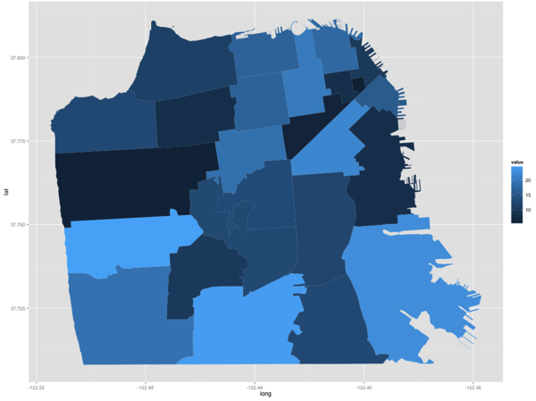
10 94112 -122.4278 37.73469 3334 FALSE 1 94112.1 18 94112 24.297588Now we can easily plot those colours onto our shapefile by calling geom_polgon instead of geom_path:
> ggplot(sf, aes(long, lat, group = group)) +
geom_polygon(aes(fill = value))
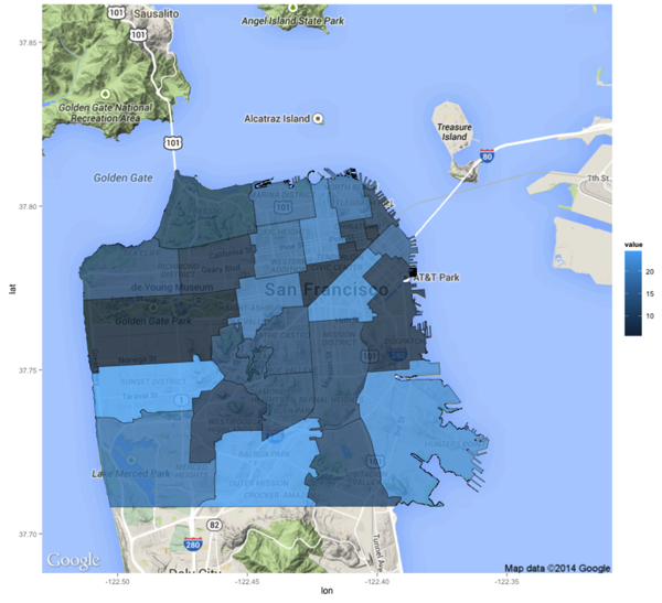
And finally let’s wire it up to our google map:
> ggmap(sfMap) +
geom_polygon(aes(fill = value, x = long, y = lat, group = group),
data = sf,
alpha = 0.8,
color = "black",
size = 0.2)
I spent way too long with the alpha value set to '0' on this last plot wondering why I wasn’t seeing any shading so don’t make that mistake!
About the author
I'm currently working on short form content at ClickHouse. I publish short 5 minute videos showing how to solve data problems on YouTube @LearnDataWithMark. I previously worked on graph analytics at Neo4j, where I also co-authored the O'Reilly Graph Algorithms Book with Amy Hodler.
