R: ggplot - Plotting a single variable line chart (geom_line requires the following missing aesthetics: y)
I’ve been learning how to do moving averages in R and having done that calculation I wanted to plot these variables on a line chart using ggplot.
The vector of rolling averages looked like this:
> rollmean(byWeek$n, 4)
  [1]  3.75  2.00  1.25  1.00  1.25  1.25  1.75  1.75  1.75  2.50  2.25  2.75  3.50  2.75  2.75
 [16]  2.25  1.50  1.50  2.00  2.00  2.00  2.00  1.25  1.50  2.25  2.50  3.00  3.25  2.75  4.00
 [31]  4.25  5.25  7.50  6.50  5.75  5.00  3.50  4.00  5.75  6.25  6.25  6.00  5.25  6.25  7.25
 [46]  7.75  7.00  4.75  2.75  1.75  2.00  4.00  5.25  5.50 11.50 11.50 12.75 14.50 12.50 11.75
 [61] 11.00  9.25  5.25  4.50  3.25  4.75  7.50  8.50  9.25 10.50  9.75 15.25 16.00 15.25 15.00
 [76] 10.00  8.50  6.50  4.25  3.00  4.25  4.75  7.50 11.25 11.00 11.50 10.00  6.75 11.25 12.50
 [91] 12.00 11.50  6.50  8.75  8.50  8.25  9.50  8.50  8.75  9.50  8.00  4.25  4.50  7.50  9.00
[106] 12.00 19.00 19.00 22.25 23.50 22.25 21.75 19.50 20.75 22.75 22.75 24.25 28.00 23.00 26.00
[121] 24.25 21.50 26.00 24.00 28.25 25.50 24.25 31.50 31.50 35.75 35.75 29.00 28.50 27.25 25.50
[136] 27.50 26.00 23.75
I initially tried to plot a line chart like this:
library(ggplot2)
library(zoo)
rollingMean = rollmean(byWeek$n, 4)
qplot(rollingMean) + geom_line()
which resulted in this error:
stat_bin: binwidth defaulted to range/30. Use 'binwidth = x' to adjust this.
Error: geom_line requires the following missing aesthetics: y
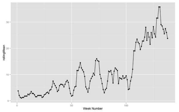
It turns out we need to provide an x and y value if we want to draw a line chart. In this case we’ll generate the 'x' value - we only care that the y values get plotted in order from left to right:
qplot(1:length(rollingMean), rollingMean, xlab ="Week Number") + geom_line()
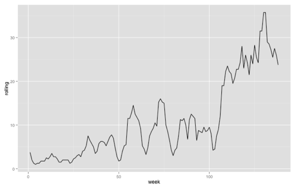
If we want to use the 'ggplot' function then we need to put everything into a data frame first and then plot it:
ggplot(data.frame(week = 1:length(rollingMean), rolling = rollingMean),
       aes(x = week, y = rolling)) +
  geom_line()
About the author
I'm currently working on short form content at ClickHouse. I publish short 5 minute videos showing how to solve data problems on YouTube @LearnDataWithMark. I previously worked on graph analytics at Neo4j, where I also co-authored the O'Reilly Graph Algorithms Book with Amy Hodler.
